Every creative work you’ve ever loved has a hero’s journey behind it. On Spark & Fire, you'll hear creators tell the story of bringing one beloved work to life. Iconic creatives — like Wicked composer Stephen Schwartz, Pixar director Domee Shi, comedian Patton Oswald, musician Wynton Marsalis, and novelist Isabel Allende — share the endless iterations, the inevitable setbacks, and the breakthrough ideas along the epic process of creation. But this isn’t an interview show. It’s a story — told ...
…
continue reading
Content provided by Craft: Exploring Creativity. All podcast content including episodes, graphics, and podcast descriptions are uploaded and provided directly by Craft: Exploring Creativity or their podcast platform partner. If you believe someone is using your copyrighted work without your permission, you can follow the process outlined here https://player.fm/legal.
Similar to Craft: Exploring Creativity
A podcast about craft, career, and creativity from Proximity Media, the production company that helped bring you Creed III, Judas and the Black Messiah, Space Jam: A New Legacy, Black Panther: Wakanda Forever podcast and soundtrack, and more. New episodes every Sunday.
…
continue reading
Tangentially Speaking is dedicated to the idea that good conversation is organic, uncensored, revelatory, and free to go down unexpected paths with unconventional people. chrisryan.substack.com
…
continue reading
An investigative podcast hosted by world-renowned literary critic and publishing insider Bethanne Patrick. Book bans are on the rise across America. With the rise of social media, book publishers are losing their power as the industry gatekeepers. More and more celebrities and influencers are publishing books with ghostwriters. Writing communities are splintering because members are at cross purposes about their mission. Missing Pages is an investigative podcast about the book publishing ind ...
…
continue reading
Timeless Practical Wisdom For Living a Meaningful Life Inspiring stories and practical advice from creatives, entrepreneurs, change-makers, misfits, and rebels to help you become successful on your own terms Our listeners say, “If TEDTalks met Oprah you’d have the Unmistakable Creative.” Eliminate the feeling of being stuck in your life, blocked in your creativity, and discover higher levels of meaning and purpose in your life and career. Listen to deeply personal, insightful, and thought-pr ...
…
continue reading
Ask questions, vote and discover answers about Chicago, the region and its people. From WBEZ.
…
continue reading
Science fiction author David Barr Kirtley (Save Me Plz and Other Stories) talks geek culture with guests such as Neil Gaiman (#253), George R. R. Martin (#22), Richard Dawkins (#46), Simon Pegg (#39), Bill Nye (#273), Margaret Atwood (#94), Neil deGrasse Tyson (#32), and Ursula K. Le Guin (#65). Geek’s Guide to the Galaxy has appeared on recommended podcast lists from NPR, The Guardian, Wired, The A.V. Club, BBC America, CBC Radio, WVXU, io9, Omni, The Strand, Library Journal, and Popular Me ...
…
continue reading
Imaginary Worlds sounds like what would happen if NPR went to ComicCon and decided that’s all they ever wanted to cover. Host Eric Molinsky spent over a decade working as a public radio reporter and producer, and he uses those skills to create thoughtful, sound-rich episodes about science fiction, fantasy, and other genres of speculative fiction. Every other week, he talks with comic book artists, game designers, novelists, screenwriters, filmmakers, and fans about how they craft their world ...
…
continue reading
Satguru Mata Sudiksha Ji Maharaj Discourses Podcast Channel
…
continue reading
Radio Ahmadiyya - the real voice of Islam is a weekly Radio Broadcast in the Urdu language with the mandate to educate its listeners about Islam and Ahmadiyyat. It presents the teachings of Islam as explained in the Holy Qur'an and by the Holy Prophet of Islam, Muhammad (Peace and Blessings of Allah be on him).
…
continue reading
Player FM - Podcast App
Go offline with the Player FM app!
Go offline with the Player FM app!

))
Visual Trumpery or How Alberto Cairo Confronts Fake News and Statistics
Manage episode 202635925 series 1000316
Content provided by Craft: Exploring Creativity. All podcast content including episodes, graphics, and podcast descriptions are uploaded and provided directly by Craft: Exploring Creativity or their podcast platform partner. If you believe someone is using your copyrighted work without your permission, you can follow the process outlined here https://player.fm/legal.
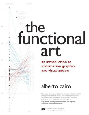
Like many of us, Alberto Cairo is a polls-junky. Whenever election season comes around, he gets locked into the numbers. But for Cairo, it’s not just a seasonal passion; he’s devoted his academic studies to graphical representations of data in news media. Currently, he teaches data visualization at the University of Miami.
Cairo became interested in data visualization after a professor noticed his ability to create quick, rudimentary sketches. The professor recommended Cairo for an internship in a graphics department for a newspaper in Spain. He was unfamiliar with data visualization when he started, but loved the field after the internship. Since his college days, he’s written two books on the subject and runs a blog called The Functional Art.
On April 15, 2018, Cairo will deliver a talk called “Visual Trumpery” at the Ohio State’s Science Sundays lecture series, a free and open to the public event. Cairo initially called the talk “How Charts Lie,” but thought it was too dull and didn’t have the draw, so he retitled it to include the word trump, meaning showy but worthless, because it’s related to the current president’s name. However, he asserts the lecture is relatively bias-free and draws on bad graphs and data from the right and the left. His primary goal is to show people how to spot the fake data and charts and to teach people how to create better, more accurate visuals.
Cairo likes to talk about percentages and how they translate to a graph. He mentions that at some point during the 2016 election, Donald Trump had a 17% chance to win the election. This statistic seems low but Cairo likens this to rolling a “1” on a six-sided dice. Cairo believes including examples like this on charts will help people discover more interesting things and understand the magnitude of data.
According to Cairo, the world of charts and graphs is simultaneously improving and getting worse. Because of the Internet, there’s a lower barrier of entry to creating and disseminating charts and graphs, which means anybody can make a figure that says anything they want. However, reputable news magazines on the right and left are using these tools to create better data-driven charts and stories.
Listen in for more about visual trumpery and then attend Professor Cairo’s talk.
201 episodes
Manage episode 202635925 series 1000316
Content provided by Craft: Exploring Creativity. All podcast content including episodes, graphics, and podcast descriptions are uploaded and provided directly by Craft: Exploring Creativity or their podcast platform partner. If you believe someone is using your copyrighted work without your permission, you can follow the process outlined here https://player.fm/legal.
Like many of us, Alberto Cairo is a polls-junky. Whenever election season comes around, he gets locked into the numbers. But for Cairo, it’s not just a seasonal passion; he’s devoted his academic studies to graphical representations of data in news media. Currently, he teaches data visualization at the University of Miami.
Cairo became interested in data visualization after a professor noticed his ability to create quick, rudimentary sketches. The professor recommended Cairo for an internship in a graphics department for a newspaper in Spain. He was unfamiliar with data visualization when he started, but loved the field after the internship. Since his college days, he’s written two books on the subject and runs a blog called The Functional Art.
On April 15, 2018, Cairo will deliver a talk called “Visual Trumpery” at the Ohio State’s Science Sundays lecture series, a free and open to the public event. Cairo initially called the talk “How Charts Lie,” but thought it was too dull and didn’t have the draw, so he retitled it to include the word trump, meaning showy but worthless, because it’s related to the current president’s name. However, he asserts the lecture is relatively bias-free and draws on bad graphs and data from the right and the left. His primary goal is to show people how to spot the fake data and charts and to teach people how to create better, more accurate visuals.
Cairo likes to talk about percentages and how they translate to a graph. He mentions that at some point during the 2016 election, Donald Trump had a 17% chance to win the election. This statistic seems low but Cairo likens this to rolling a “1” on a six-sided dice. Cairo believes including examples like this on charts will help people discover more interesting things and understand the magnitude of data.
According to Cairo, the world of charts and graphs is simultaneously improving and getting worse. Because of the Internet, there’s a lower barrier of entry to creating and disseminating charts and graphs, which means anybody can make a figure that says anything they want. However, reputable news magazines on the right and left are using these tools to create better data-driven charts and stories.
Listen in for more about visual trumpery and then attend Professor Cairo’s talk.
201 episodes
All episodes
×Welcome to Player FM!
Player FM is scanning the web for high-quality podcasts for you to enjoy right now. It's the best podcast app and works on Android, iPhone, and the web. Signup to sync subscriptions across devices.
Similar to Craft: Exploring Creativity
Every creative work you’ve ever loved has a hero’s journey behind it. On Spark & Fire, you'll hear creators tell the story of bringing one beloved work to life. Iconic creatives — like Wicked composer Stephen Schwartz, Pixar director Domee Shi, comedian Patton Oswald, musician Wynton Marsalis, and novelist Isabel Allende — share the endless iterations, the inevitable setbacks, and the breakthrough ideas along the epic process of creation. But this isn’t an interview show. It’s a story — told ...
…
continue reading
A podcast about craft, career, and creativity from Proximity Media, the production company that helped bring you Creed III, Judas and the Black Messiah, Space Jam: A New Legacy, Black Panther: Wakanda Forever podcast and soundtrack, and more. New episodes every Sunday.
…
continue reading
Tangentially Speaking is dedicated to the idea that good conversation is organic, uncensored, revelatory, and free to go down unexpected paths with unconventional people. chrisryan.substack.com
…
continue reading
An investigative podcast hosted by world-renowned literary critic and publishing insider Bethanne Patrick. Book bans are on the rise across America. With the rise of social media, book publishers are losing their power as the industry gatekeepers. More and more celebrities and influencers are publishing books with ghostwriters. Writing communities are splintering because members are at cross purposes about their mission. Missing Pages is an investigative podcast about the book publishing ind ...
…
continue reading
Timeless Practical Wisdom For Living a Meaningful Life Inspiring stories and practical advice from creatives, entrepreneurs, change-makers, misfits, and rebels to help you become successful on your own terms Our listeners say, “If TEDTalks met Oprah you’d have the Unmistakable Creative.” Eliminate the feeling of being stuck in your life, blocked in your creativity, and discover higher levels of meaning and purpose in your life and career. Listen to deeply personal, insightful, and thought-pr ...
…
continue reading
Ask questions, vote and discover answers about Chicago, the region and its people. From WBEZ.
…
continue reading
Science fiction author David Barr Kirtley (Save Me Plz and Other Stories) talks geek culture with guests such as Neil Gaiman (#253), George R. R. Martin (#22), Richard Dawkins (#46), Simon Pegg (#39), Bill Nye (#273), Margaret Atwood (#94), Neil deGrasse Tyson (#32), and Ursula K. Le Guin (#65). Geek’s Guide to the Galaxy has appeared on recommended podcast lists from NPR, The Guardian, Wired, The A.V. Club, BBC America, CBC Radio, WVXU, io9, Omni, The Strand, Library Journal, and Popular Me ...
…
continue reading
Imaginary Worlds sounds like what would happen if NPR went to ComicCon and decided that’s all they ever wanted to cover. Host Eric Molinsky spent over a decade working as a public radio reporter and producer, and he uses those skills to create thoughtful, sound-rich episodes about science fiction, fantasy, and other genres of speculative fiction. Every other week, he talks with comic book artists, game designers, novelists, screenwriters, filmmakers, and fans about how they craft their world ...
…
continue reading
Satguru Mata Sudiksha Ji Maharaj Discourses Podcast Channel
…
continue reading
Radio Ahmadiyya - the real voice of Islam is a weekly Radio Broadcast in the Urdu language with the mandate to educate its listeners about Islam and Ahmadiyyat. It presents the teachings of Islam as explained in the Holy Qur'an and by the Holy Prophet of Islam, Muhammad (Peace and Blessings of Allah be on him).
…
continue reading
Player FM - Podcast App
Go offline with the Player FM app!
Go offline with the Player FM app!


