The iFanboy.com Comic Book Podcast is a weekly talk show all about the best new current comic book releases. Lifelong friends, Conor Kilpatrick and Josh Flanagan talk about what they loved and (sometimes) hated in the current weekly books, from publishers like Marvel, DC, Image Comics, Dark Horse Comics, BOOM! Studios, IDW, Aftershock, Valiant, and more. The aim is to have a fun time, some laughs, but to also really understand what makes comic books work and what doesn’t, and trying to under ...
…
continue reading
Content provided by Enrico Bertini and Moritz Stefaner, Enrico Bertini, and Moritz Stefaner. All podcast content including episodes, graphics, and podcast descriptions are uploaded and provided directly by Enrico Bertini and Moritz Stefaner, Enrico Bertini, and Moritz Stefaner or their podcast platform partner. If you believe someone is using your copyrighted work without your permission, you can follow the process outlined here https://player.fm/legal.
Similar to Data Stories
Every creative work you’ve ever loved has a hero’s journey behind it. On Spark & Fire, you'll hear creators tell the story of bringing one beloved work to life. Iconic creatives — like Wicked composer Stephen Schwartz, Pixar director Domee Shi, comedian Patton Oswald, musician Wynton Marsalis, and novelist Isabel Allende — share the endless iterations, the inevitable setbacks, and the breakthrough ideas along the epic process of creation. But this isn’t an interview show. It’s a story — told ...
…
continue reading
Welcome to the FroKnowsPhoto Podcast where we discuss all things Photography. From Nikon to Canon Cameras and all the lenses and accessories for your camera bag. If you are into photography looking to pick up tips, tricks, reviews and our personal views than this is the podcast for you. Please subscribe for the latest episodes.
…
continue reading
A podcast about craft, career, and creativity from Proximity Media, the production company that helped bring you Creed III, Judas and the Black Messiah, Space Jam: A New Legacy, Black Panther: Wakanda Forever podcast and soundtrack, and more. New episodes every Sunday.
…
continue reading
A weekly comic book podcast by fans for fans. Reviews, discussions, news, contests and more.
…
continue reading
Flash Forward is a show about possible (and not so possible) future scenarios. What would the warranty on a sex robot look like? How would diplomacy work if we couldn’t lie? Could there ever be a fecal transplant black market? (Complicated, it wouldn’t, and yes, respectively, in case you’re curious.) Hosted and produced by award winning science journalist Rose Eveleth, each episode combines audio drama and journalism to go deep on potential tomorrows, and uncovers what those futures might re ...
…
continue reading
The Modern Art Notes Podcast is a weekly, hour-long interview program featuring artists, historians, authors, curators and conservators. Pulitzer Prize-winning art critic Sebastian Smee called The MAN Podcast “one of the great archives of the art of our time.” When the US chapter of the International Association of Art Critics gave host Tyler Green one of its inaugural awards for criticism in 2014, it included a special citation for The MAN Podcast.
…
continue reading
Hanselminutes is Fresh Air for Developers. A weekly commute-time podcast that promotes fresh technology and fresh voices. Talk and Tech for Developers, Life-long Learners, and Technologists.
…
continue reading
Read along with the Sword and Laser book club! From classic science fiction to the latest gritty fantasy, we cover it. Subscribe for book discussions, author interviews, hot releases, and news from the genre fiction world!
…
continue reading
Rock and Roll
…
continue reading
Player FM - Podcast App
Go offline with the Player FM app!
Go offline with the Player FM app!

))
Simulated Dendrochronology of U.S. Immigration with Pedro Cruz and John Wihbey
Manage episode 228760739 series 32120
Content provided by Enrico Bertini and Moritz Stefaner, Enrico Bertini, and Moritz Stefaner. All podcast content including episodes, graphics, and podcast descriptions are uploaded and provided directly by Enrico Bertini and Moritz Stefaner, Enrico Bertini, and Moritz Stefaner or their podcast platform partner. If you believe someone is using your copyrighted work without your permission, you can follow the process outlined here https://player.fm/legal.
[There are no ads on Data Stories because we’re listener-supported; please consider contributing to the show! Oh…and now Data Stories is on Instagram!]


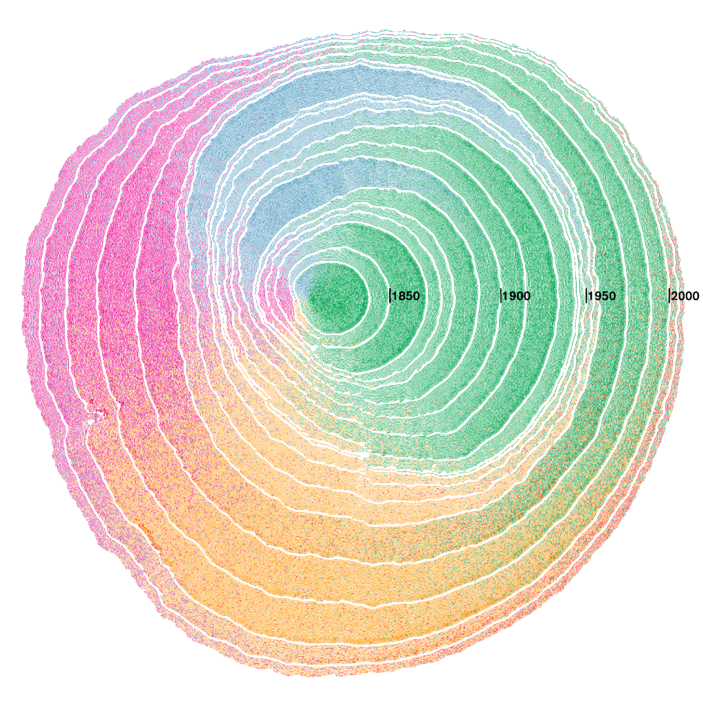
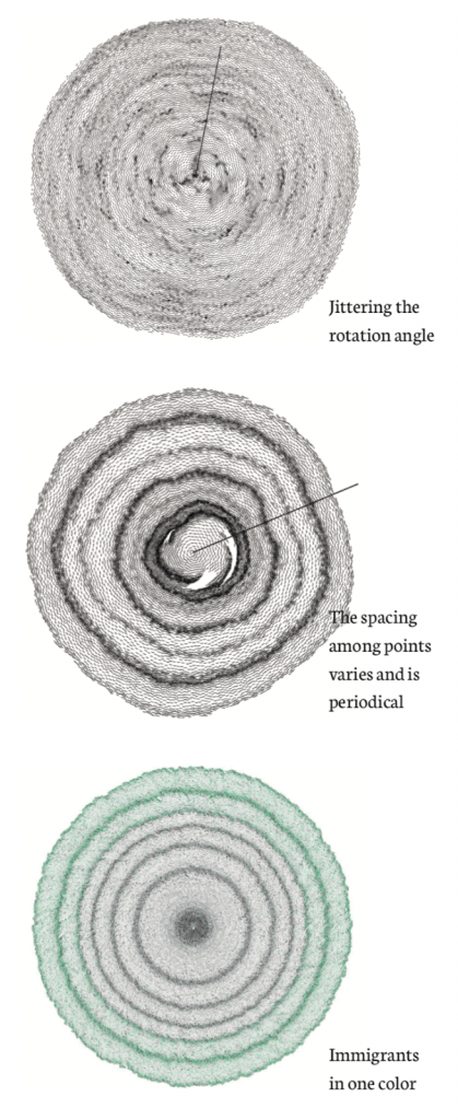
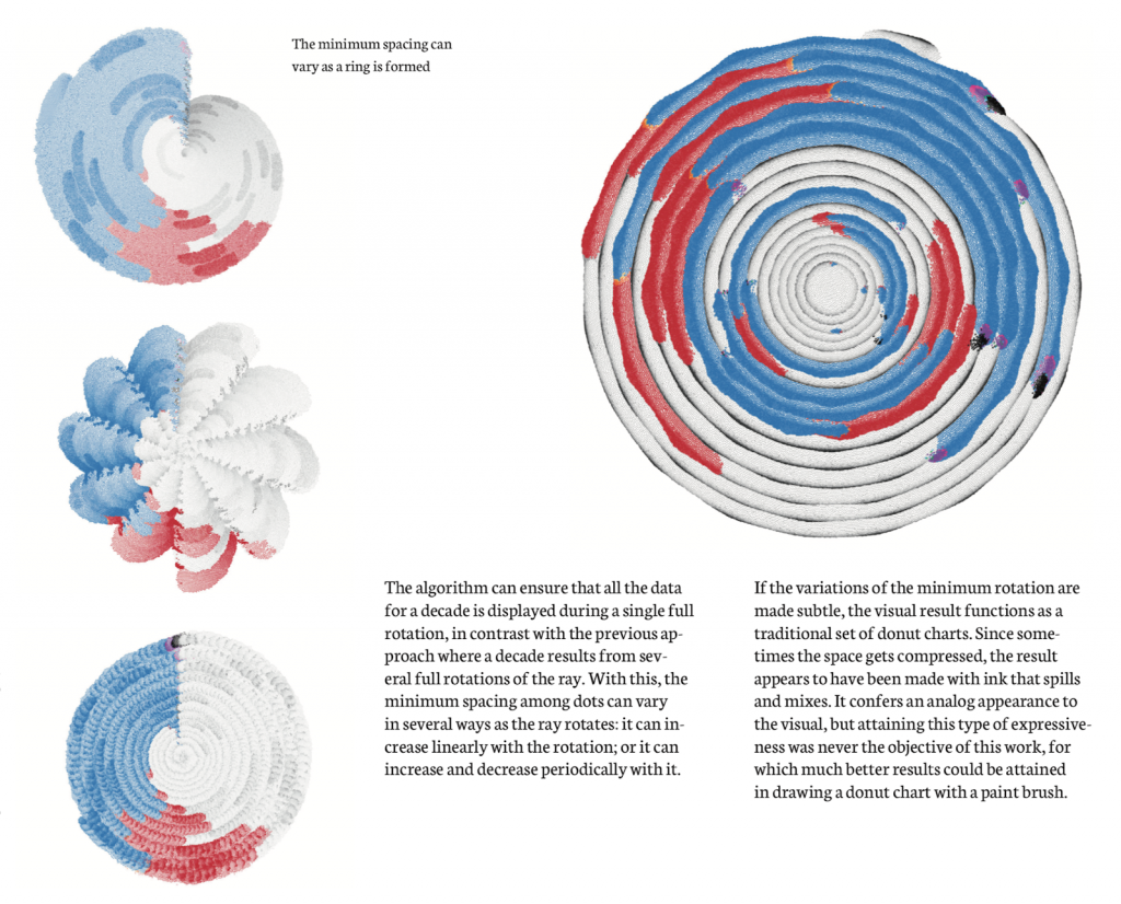
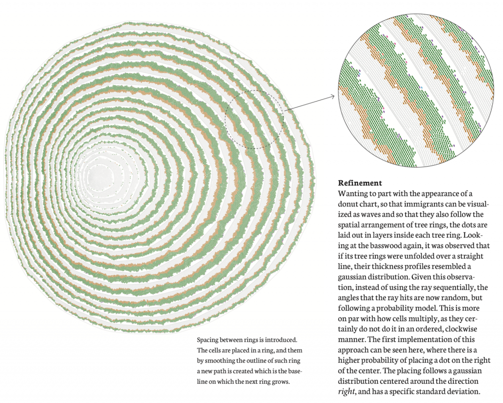
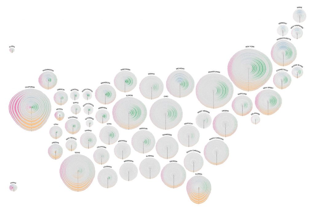

We have Pedro Cruz and John Wihbey on the show to talk about their beautiful project, the Simulated Dendrochronology of U.S. Immigration. There are many ways that immigration can be represented visually, but Pedro and John came up with a very compelling one: they use the metaphor of tree rings to show how migration patterns of people to the United States have changed over time. The final piece is utterly beautiful and evocative: we are the product of many layers of immigration.
On the show we talk about how they came up with this idea, the implementation of the visualization, the attempts they tried before producing the final version, and the role of metaphors in visualization. Make sure you take a closer look at the visualization before listening!
And enjoy the show!
Links
- Project Page and Video
- Pedro Cruz
- John Wihbey
- George Lakoff and Mark Johnson, Metaphors We Live By
- Andrew Ortony, “Metaphor and Representation” in Metaphor and Thought
- Donna Cox “The Art and Science of Visualization: Metaphorical Maps and Cultural Models”
- John’s upcoming book: The Social Fact (MIT Press, April 2019)
Chapters
1. Welcome to Data Stories! (00:00:25)
2. There are no ads on Data Stories because we're listener-supported; please consider contributing to the show! (00:00:58)
3. A new Data Stories update: we're on Instagram! (00:01:37)
4. Introducing today's episode on Simulated Dendrochronology (00:01:59)
5. Introducing Pedro Cruz (00:02:20)
6. Introducing John Wihbey (00:02:50)
7. What is Dendrochronology? (00:03:35)
8. How does the visualization work? (00:04:52)
9. Where did the idea for this visualization come from? (00:07:50)
10. How did you implement the tree ring idea and come up with an algorithm? (00:12:48)
11. Why the tree cross section was an especially appropriate metaphor for immigration (00:18:40)
12. Tips and resources for further exploration into metaphors (00:30:02)
13. The project's reception (00:31:45)
14. Get in touch with us and support us on Patreon (00:37:30)
173 episodes
Manage episode 228760739 series 32120
Content provided by Enrico Bertini and Moritz Stefaner, Enrico Bertini, and Moritz Stefaner. All podcast content including episodes, graphics, and podcast descriptions are uploaded and provided directly by Enrico Bertini and Moritz Stefaner, Enrico Bertini, and Moritz Stefaner or their podcast platform partner. If you believe someone is using your copyrighted work without your permission, you can follow the process outlined here https://player.fm/legal.
[There are no ads on Data Stories because we’re listener-supported; please consider contributing to the show! Oh…and now Data Stories is on Instagram!]
We have Pedro Cruz and John Wihbey on the show to talk about their beautiful project, the Simulated Dendrochronology of U.S. Immigration. There are many ways that immigration can be represented visually, but Pedro and John came up with a very compelling one: they use the metaphor of tree rings to show how migration patterns of people to the United States have changed over time. The final piece is utterly beautiful and evocative: we are the product of many layers of immigration.
On the show we talk about how they came up with this idea, the implementation of the visualization, the attempts they tried before producing the final version, and the role of metaphors in visualization. Make sure you take a closer look at the visualization before listening!
And enjoy the show!
Links
- Project Page and Video
- Pedro Cruz
- John Wihbey
- George Lakoff and Mark Johnson, Metaphors We Live By
- Andrew Ortony, “Metaphor and Representation” in Metaphor and Thought
- Donna Cox “The Art and Science of Visualization: Metaphorical Maps and Cultural Models”
- John’s upcoming book: The Social Fact (MIT Press, April 2019)
Chapters
1. Welcome to Data Stories! (00:00:25)
2. There are no ads on Data Stories because we're listener-supported; please consider contributing to the show! (00:00:58)
3. A new Data Stories update: we're on Instagram! (00:01:37)
4. Introducing today's episode on Simulated Dendrochronology (00:01:59)
5. Introducing Pedro Cruz (00:02:20)
6. Introducing John Wihbey (00:02:50)
7. What is Dendrochronology? (00:03:35)
8. How does the visualization work? (00:04:52)
9. Where did the idea for this visualization come from? (00:07:50)
10. How did you implement the tree ring idea and come up with an algorithm? (00:12:48)
11. Why the tree cross section was an especially appropriate metaphor for immigration (00:18:40)
12. Tips and resources for further exploration into metaphors (00:30:02)
13. The project's reception (00:31:45)
14. Get in touch with us and support us on Patreon (00:37:30)
173 episodes
All episodes
×Welcome to Player FM!
Player FM is scanning the web for high-quality podcasts for you to enjoy right now. It's the best podcast app and works on Android, iPhone, and the web. Signup to sync subscriptions across devices.
Similar to Data Stories
The iFanboy.com Comic Book Podcast is a weekly talk show all about the best new current comic book releases. Lifelong friends, Conor Kilpatrick and Josh Flanagan talk about what they loved and (sometimes) hated in the current weekly books, from publishers like Marvel, DC, Image Comics, Dark Horse Comics, BOOM! Studios, IDW, Aftershock, Valiant, and more. The aim is to have a fun time, some laughs, but to also really understand what makes comic books work and what doesn’t, and trying to under ...
…
continue reading
Every creative work you’ve ever loved has a hero’s journey behind it. On Spark & Fire, you'll hear creators tell the story of bringing one beloved work to life. Iconic creatives — like Wicked composer Stephen Schwartz, Pixar director Domee Shi, comedian Patton Oswald, musician Wynton Marsalis, and novelist Isabel Allende — share the endless iterations, the inevitable setbacks, and the breakthrough ideas along the epic process of creation. But this isn’t an interview show. It’s a story — told ...
…
continue reading
Welcome to the FroKnowsPhoto Podcast where we discuss all things Photography. From Nikon to Canon Cameras and all the lenses and accessories for your camera bag. If you are into photography looking to pick up tips, tricks, reviews and our personal views than this is the podcast for you. Please subscribe for the latest episodes.
…
continue reading
A podcast about craft, career, and creativity from Proximity Media, the production company that helped bring you Creed III, Judas and the Black Messiah, Space Jam: A New Legacy, Black Panther: Wakanda Forever podcast and soundtrack, and more. New episodes every Sunday.
…
continue reading
A weekly comic book podcast by fans for fans. Reviews, discussions, news, contests and more.
…
continue reading
Flash Forward is a show about possible (and not so possible) future scenarios. What would the warranty on a sex robot look like? How would diplomacy work if we couldn’t lie? Could there ever be a fecal transplant black market? (Complicated, it wouldn’t, and yes, respectively, in case you’re curious.) Hosted and produced by award winning science journalist Rose Eveleth, each episode combines audio drama and journalism to go deep on potential tomorrows, and uncovers what those futures might re ...
…
continue reading
The Modern Art Notes Podcast is a weekly, hour-long interview program featuring artists, historians, authors, curators and conservators. Pulitzer Prize-winning art critic Sebastian Smee called The MAN Podcast “one of the great archives of the art of our time.” When the US chapter of the International Association of Art Critics gave host Tyler Green one of its inaugural awards for criticism in 2014, it included a special citation for The MAN Podcast.
…
continue reading
Hanselminutes is Fresh Air for Developers. A weekly commute-time podcast that promotes fresh technology and fresh voices. Talk and Tech for Developers, Life-long Learners, and Technologists.
…
continue reading
Read along with the Sword and Laser book club! From classic science fiction to the latest gritty fantasy, we cover it. Subscribe for book discussions, author interviews, hot releases, and news from the genre fiction world!
…
continue reading
Rock and Roll
…
continue reading
Player FM - Podcast App
Go offline with the Player FM app!
Go offline with the Player FM app!


